A well-designed business card is crucial for establishing your brand and effectively conveying information about your services or products. It plays a significant role in networking and growing your client base. Designing a quality business card requires careful planning to accurately reflect your brand and resonate with your target audience.
To help in the process, we’ve listed 10 common business card mistakes to avoid and practical solutions for designing your cards. Let’s go through these tips to make sure your cards have a big impact and help your business grow.
Key Takeaways
- A well-designed business card should use high-quality materials, clear fonts (minimum 7–8 pt), and updated contact details to reflect your brand professionally.
- Common business card design mistakes include overcrowding the layout, using low-quality images or fonts, and neglecting the back of the card.
- Not aligning the design with your brand weakens credibility and reduces the card’s impact in networking or client interactions.
What are business card mistakes?
Business card mistakes reduce your chances of making a strong first impression with potential clients, partners, or networking contacts. When designers use cluttered layouts, hard-to-read fonts, or poor color contrast, they make the card difficult to scan quickly.
Errors like typos, inconsistent spacing, or overloaded information also distract the reader and reflect poorly on your professionalism. To make your business card effective, you should focus on clarity, proper hierarchy, and clean presentation so your message stands out and supports your networking goals.
10 common business card design mistakes to avoid
The standard business card size is 3.5″ x 2″, which isn’t much space to work with. It’s important to use this space wisely to catch the eye of the person receiving the card.
A poorly-designed and unprofessional card could make potential customers lose interest, even if they need your products or services. Now, let’s look at the common business card mistakes to avoid.
Leaving out important contact information
When it comes to visiting cards, size doesn’t dictate the importance of information. Your card serves as the primary point of contact for potential business interactions, making it crucial to provide essential details.
So, here are the essential business card information that you must include:
- Your name
- Company name
- Job title
- Business phone number
- Email address
- Company website
- Business social media accounts and LinkedIn profiles
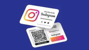
Tip: Incorporating a QR code simplifies sharing without cluttering the design. This QR code can direct recipients to your company website, LinkedIn profile, or facilitate email correspondence.
Using poor quality card stock
With 72% of people basing their judgement on the quality of your visiting card, its significance cannot be overstated. Shockingly, 39% would reconsider doing business if the card feels cheap. While design and information are crucial, the card’s material conveys the perceived quality of your products or services.
So, which paper stock should you choose?
For a quality impression, opt for a 400gsm – 450gsm paper stock. Alternatively, for a premium standout card, consider 810gsm Triplex business cards. Their durability ensures your business gets noticed for all the right reasons.
Using low-quality images
One of the most frequent mistakes made by non-professional designers is using low-quality images. Logos, social media icons, or headshots may look sharp on a computer screen but turn pixelated once printed. To prevent this error, ensure your files are 300 dpi or higher.
Typography mistakes
When choosing fonts for your business card, prioritise readability and representation. Avoid decorative or overly stylized fonts, such as comic sans, as they can be challenging to read in a small space. Additionally, consider your industry when selecting a font; for instance, using a casual or whimsical font might not be suitable for a law firm.
A helpful guideline is to use a type size no smaller than 7 or 8 points. Your name can be slightly larger, around 9 points, while the company name typically looks best at about 12 to 15 points.

Outdated information
Outdated email addresses, non-existent websites, and broken QR codes create a poor impression of your company and hinder prospects from contacting you effectively.
Fortunately, visiting card printing is affordable, making it easy to reprint them when you update your website. Additionally, opting for unlaminated cards makes them recyclable, aligning with sustainable business practices.
Pro Tip: QR codes may behave differently in print than on screen. Always request a proof from your printer to test QR code functionality before finalising your order!
Related: What is a Digital Business Cards?
Not matching branding
Building your brand story is crucial. To make a lasting impression, steer clear of generic visuals on your card and opt for distinctive branding that sets you apart. Incorporate your logo and website colours into the design for recognition. This consistent branding helps customers connect with your products or services more effectively.

A visually cluttered card
When designing your card, avoid overloading it with information. Too many elements can overwhelm the reader and distract from the main goal: facilitating contact with prospective clients. Keep it simple by introducing yourself and providing easy contact options.
Top tip: Leave some white space on your card. It not only highlights important details but also offers space for writing down notes if necessary.
Grammatical errors and typos
While it may seem straightforward, many visiting cards contain spelling and grammatical errors, which can be surprising. While simple mistakes are common, typos can create a negative impression of your business among customers.
In summary, it’s essential to thoroughly check your business cards multiple times for any errors before sending them for printing.
Ignoring the cut line, bleed, and safe area
After designing your company visiting card, ensure the bleed line, cut line, and safety line align correctly. The bleed line marks the area where your design can extend without being cut off.
The safety line ensures all text remains within a designated area, while the cut line indicates where the card will be trimmed.
While printer specifications vary, aim for at least 0.25 inches (6mm) of bleed in your design to avoid any cut-off issues.
Be strategic with the limited space and mindful of white space to ensure your design is effective when printed.


