Abusiness cardserves as the perfect networking tool, summarising your professional identity in a concise format. Among its critical elements, font selection is key.
Fonts are a tool that can communicate the voice of your brand, shaping how recipients perceive and engage with your information. With thousands of font styles available, finding a style that fits your business can be challenging.
The fonts on your business card serve two primary functions: attracting attention and ensuring readability. In this guide, we’ll explore the significance of typography in design, explore the best fonts for business cards, and discuss the ideal font size for your business card.
Types of fonts
First things first. What are the three main types of fonts to consider for your business card?
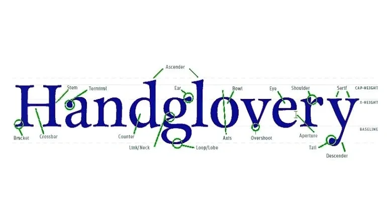
Serif fonts
Serifs come from carved inscriptions on historic buildings and gravestones. This makes serif fonts ideal for giving your brand a traditional and well-established look.
Because of their classic style, serif fonts are commonly used in books, newspapers, and magazines. Many believe that serifs help the eye move across the text, making long passages easier to read.
Sans serif fonts
A sans-serif font is a typeface without decorative lines, called ‘serifs,’ at the end of each stroke. These fonts have consistent line widths and are easy to read quickly, making them ideal for business names or headings on printed products like business cards. Sans-serif fonts convey simplicity and minimalism, making them suitable for modern designs.
Script fonts
Script fonts convey a human touch with flowing cursive strokes and handwritten-style calligraphy. Ideal for invitations, greeting cards, and headlines, classic scripts offer elegance, while rounder ones add fun.
Factors to consider when choosing a business card font
Before asking yourself what font is best for your business cards, there are some elements you should take into account. Here are a few factors to keep in mind:
1. Font Sizes: Ensure readability at smaller point sizes, which are typical for business cards. Test the font at the actual card size to confirm that all information remains clear.
2. Font Weights: Fonts come in various weights such as bold, medium, or thin, impacting their visibility and clarity, particularly in print. Thinner fonts may not print as distinctly as bolder ones, especially at smaller sizes.
3. Legibility: Prioritise legibility over style when choosing a font. Choose fonts that are entirely legible at all sizes, ensuring that no details are lost. Avoid overly ornate scripts that may sacrifice readability for aesthetics.
4. Compatibility: Font pairing is an art, and finding the right combination requires experimentation. Play with combinations of sans serif, serif, and script fonts to discover what works best for your brand. Additionally, choose fonts with compatible strokes and shapes as your logo design for consistency in branding.
The best fonts for business cards to represent your brand
The ideal business card font varies for each company, reflecting its brand image and resonating with its audience. Selecting the right font demands a strategic approach, creativity, and perhaps some intuition.
Many companies choose traditional fonts like Arial, Helvetica, and Times New Roman for their business cards. While these are easy to read, they’re also quite common, doing little to make your brand stand out.
You can choose alternative fonts that are still highly readable while setting your brand apart. Here’s a list of 10 inspirational visiting card fonts to help you get started:
Times new roman

Times New Roman is a classic serif font designed for readability and legibility. Its elegant and timeless appearance makes it suitable for various applications, including visiting cards.
Times New Roman looks the best when used as body text, so you might want to blend it into your calling card design as a secondary text.
Designer: Stanley Morison, Victor Lardent (1931).
Why it works for print: Times New Roman is widely recognized and easy to read, making it a reliable choice for printed materials like visiting cards. Its balanced proportions and consistent stroke width ensure clear legibility even at smaller sizes.
Helvetica
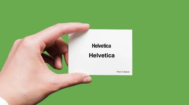
Helvetica is a minimalist sans-serif font known for its clean and legible design. It is widely used for business cards, letterheads, logos, and more.
Designer: Max Miedinger, Eduard Hoffmann (1957)
Why it works for print: Helvetica’s simplicity and clarity make it a popular choice for printed materials like visiting cards. Its neutral design and even stroke widths ensure legibility at small sizes, effectively conveying essential information.
Arial

Arial is a popular sans-serif font known for its similar metric and character widths to Helvetica. It is commonly used for classy headlines, logos, and body text. With its availability in various sizes, styles, and weights, Arial can provide your business cards with a clean, crisp, and legible appearance.
Designer: Robin Nicholas, Patricia Saunders (1982)
Why it works for print: Arial’s versatility and clean design make it one of the best fonts for visiting cards.
Futura

Futura is a sans-serif font designed around circular geometric shapes. It features thin, rounded letters with an efficient appearance, making it a popular choice for calling cards.
Named “the typeface of today and tomorrow,” Futura was extensively used in marketing campaigns for Bauer and its American subsidiaries. It also includes localised glyphs for various European languages, especially German.
Designer: Paul Renner (1927)
Why it works for print: Futura’s clean and geometric design ensures high readability, even at small sizes. Its modern and sleek appearance adds a professional touch to visiting cards, helping your brand stand out effectively.
Black caviar

Black Caviar is a modern script font with a luxurious feel. It adds a humanistic touch with its handwritten-like letterheads, making names and signatures on your business cards look as if written by hand. This font is popular among graphic designers for its elegant and personalised appearance.
Designer: Nicky Laatz
Why it works for print: Black Caviar’s stylish script design makes a memorable impression while maintaining readability. Its multiple variations allow it to be easily paired with serif or sans-serif fonts, making it versatile for creative and innovative businesses.
This font is perfect for highlighting key elements on your business card, such as your name or company slogan, while conveying a sophisticated and personal touch.
Roboto

Roboto is a modern sans-serif font designed for digital interfaces and print media. Its clean and versatile design makes it suitable for a wide range of applications, including business cards. It’s one of the designers’ most loved fonts for business cards, belonging to the sans-serif font family with 28 alternative styles. Its 6 different weights make it quite versatile.
Designer: Christian Robertson (2011)
Why it works for print: Roboto offers excellent legibility and readability, even at small sizes commonly used on business cards. Its balanced proportions and distinctive letterforms make it an attractive choice for conveying professionalism and modernity.
Riviera
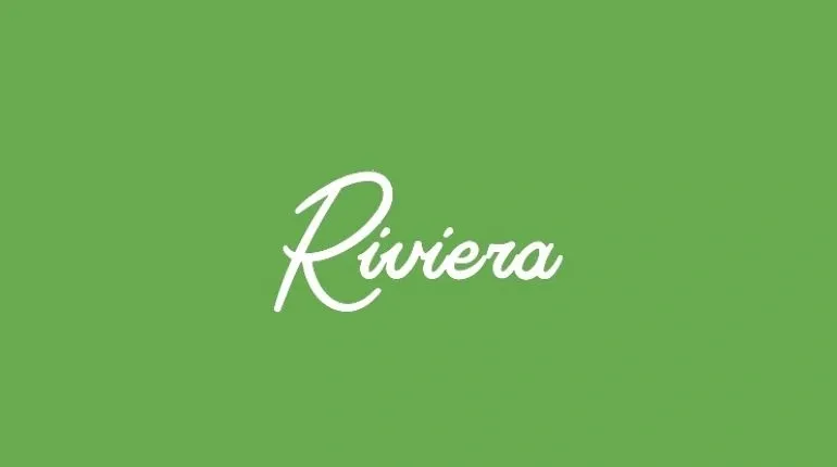
Riviera is a script font featuring innovative character design to add a unique oomph to your text. While it’s primarily reserved for logos, it has recently found use in business cards and headlines, offering a modern and stylish look.
Designer: Mark van Bronkhorst (2013)
Why it works for print: Riviera’s distinctive and elegant design makes it a standout choice for business cards. However, it is best used for primary text or logos, as it may not be ideal for secondary texts due to its intricate details.
Leyton
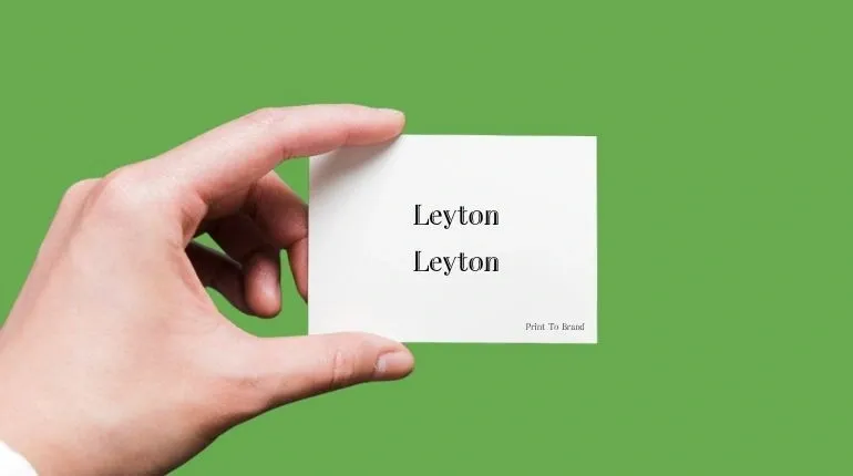
Leyton is a sophisticated serif font that blends traditional and modern elements, making it an ideal choice for luxury businesses seeking to convey elegance and prestige. Its refined curves and attention to detail make Leyton perfect for high-end business cards.
Designer: Atipo Foundry
Why it works for print: Leyton’s clean and sharp design ensures exceptional readability at various sizes, making it suitable for headings and names on business cards for fashion logos, agencies, and hotels. Its luxurious appearance adds a regal touch, enhancing the overall impression of your printed materials.
Myriad pro
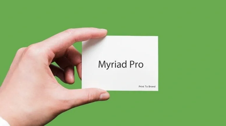
Myriad Pro is a modern sans-serif font known for its use in Apple’s corporate materials from 2002 to 2017. With thin strokes and open letterforms, it offers simplicity and readability, making it ideal for visiting cards.
Designer: Robert Slimbach, Carol Twombly (1992)
Why it works for print: Myriad Pro’s simplicity and readability make it suitable for incorporating other design elements, such as logos or images, on visiting cards. It ensures easy reading without distracting from other aspects of the card.
Baskerville

Baskerville utilises traditional serif typefaces while incorporating modern features like tapered serifs and a vertical letter axis. This combination makes Baskerville easy to read and ideal for conveying a sense of old-school elegance and grandeur on your calling card.
Designer: John Baskerville (1757)
Why it works for print: Baskerville’s timeless design ensures readability and legibility, even at smaller sizes typically used on business cards. Its crisp letterforms and well-defined serifs make it stand out while maintaining a sense of refinement.
What's the best font size for business cards?
The perfect size for business cards is 10 pt to 16 pt when it comes to font size. If you really have to reduce the size, the smallest advisable font size is 8pt. While very small text may look acceptable on screen, it doesn’t translate well to print. Anything smaller than 8pt will be unreadable.
Font size strategy:
Font sizes are typically measured in points, which is the unit you see when adjusting text size in Word documents or Photoshop files. Over the past 200 years, the size of a point has ranged from 0.18 to 0.4 millimetres. Additionally, there are approximately 72 points in one inch. This highlights how small points truly are.
Prominent business card information, such as your company name or full name, should ideally range between 10pt and 16pt, depending on available space.
For secondary text, like your job title, email address, phone number, or Instagram handle, ensure it remains visible and legible but appears noticeably smaller than the primary text.
Sans serif fonts are easier to read, even in small sizes. However, script and serif fonts can become almost illegible when used in smaller sizes. Therefore, the best font size for your business card largely depends on the typeface you choose.
4 font tips for your business card
Here are some tips for using fonts on your business card:
- Combine a script or serif font with a sans-serif.
- Avoid using fonts that look too similar.
- Use various weights (bold, regular, italic) of the same font to add contrast.
- Limit the number of font sizes to three or fewer (two is best) on your business card.
- Ensure there’s enough contrast between text and background for each text field to stand out.
How Print To Brand can help
Designing business cards is an art that has evolved over centuries. To ensure your efforts are worthwhile, it’s crucial to follow established best practices.
At Print To Brand, we’ve helped numerous clients find the perfect design and font for their business cards. Our comprehensive guidance guarantees the best results tailored to your needs.


